With nelsons Nelsons face I tried using the morph modifier but I could not seem to get the hang of it. For some reason it kept throwing up errors I believe this is due to the biped. So in the end I decided to use soft selection and move the vertices's and key frame. I spent a long time making the eye lid go around the eye for the blinking, but after doing that I found if you just move the eye lid down it does not matter if the lid intersects with the eye, it has exactly the same effect! I will know next time.
I also spent a long time on camera angles and the lighting I ended up using a very simple target light and just rotating it around. I went on a few media sites and found that a shot looking down on a character shows venerability and fatality so I decided to use this type of shot in my scene. To be honest I am very pleased with the final render.
Thursday, 13 December 2007
Wednesday, 28 November 2007


Tuesday, 27 November 2007
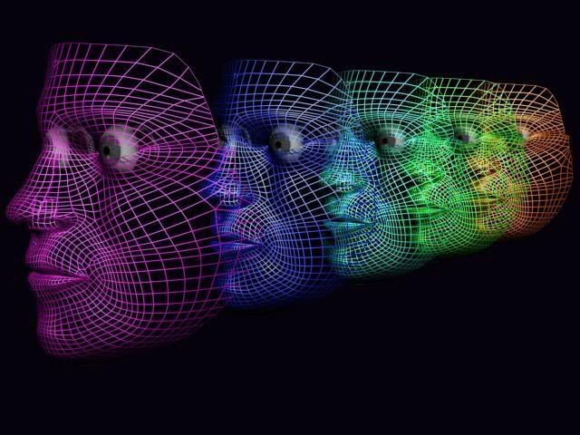
the man who made it all happen
I had a few problems with this chap as I am sure most of you know about! but I got there in the end. I'm relay pleased with the jacket especially. I managed to find a material e.g. my motocross helmet cover, witch pretty much matched nelsons jacket exactly so I took a few pics messed around with it in photoshop, uvw mapped it job done, all in all I had 10 different jacket materials you will probably notice the differences in the render's I post. The trousers I found a really simple tutorial on "tutorialised" witch done the trick. I also managed to find a close up of his jacket buttons so I had them away quite pleased with the out come there.


crews clothes
Iv just uploaded the crews clothes on humyo. I noticed from a few pics that all the clothes are very similar just small variations of each other e.g. long sleeve, v- neck etc. due to the model it is quite easy to just delete or add polygons so altering the clothes is easy.
Wednesday, 21 November 2007
plugins? wiil it cause problems!
I have spent the last three days constantly on max really trying to get to grips with all the mapping techniques I have managed to create all the flags (English,French, every man will do his duty etc).
I have been having a go at the uniforms and found a really good tutorial on deviant art, but it needs a plugin! will using this cause problems further down the line?
I have been having a go at the uniforms and found a really good tutorial on deviant art, but it needs a plugin! will using this cause problems further down the line?
Wednesday, 14 November 2007


Mapping in maxx
Once my map was made in Photoshop I applied the map to the mask and the map was tiny! after a little discussion I found out that I should have rendered the template and saved the rendered image instead of maximizing the view port and using print screen (whoops) once sorting the the map again I applied the new one the mesh and with a little persuasion using the map coordinates managed to make it fit.
The joy of mapping
This part was the make or break of the face. to see weather all the work getting the topology right and the correct alignment had all come right.
I started with the (Unwrap UVW mapping) and print screened the template in to Photoshop and with a bit of advice started to merge the three images together by playing around with mainly the eraser and clone stamp. As mentioned earlier I had problems with the lighting in the photos so Once I flipped the image, one side was a considerably amount lighter than the other I played around with the color settings and did the best I could to match.
It ended Up that the map was darker than the original photo.
I also noticed that after adjusting the map to fit the template my map hardly looked distorted any ideas why?
image will follow having trouble uploading
final model details

Next was the task to add in the lips and nose to make me look a little more human and less like the( Phantom of the Opera). This is were It went a bit crazy I forgot to turn of the snap icon so I changed the the left view and tried to find and weld all the extruded vertices's. I had to add a lot more detail buy using the using the cut tool especially in the nostril area.
Messing with the Verticies


After setting up the the two topology images in 3d max. I started pulling around the vertices's to match up with the topology. After this I then looked at the mask and it did not resemble me at all :( . Mainly the cheek and eye area, basically half my face. the problem was I did not pull them forward enough witch ended up as a pointy face, Where as in reality I have hamster cheeks. So I spent many hours trying to make the face even slightley resemble me in class and lesson, where I found out max8 and max9 were not compatible witch made my day, similarly kneeing my USB and bending it was handy as well!
Tipology

After messing around with the picture e.g. getting it to match up and correcting any lens distortion, witch was actually quite tricky due to the picture not being that brilliant, but in the end matched up pretty well. But for some reason the lighting is completely different in each of the images! even though they were taken in exactly the same place one after the other.

Due to the mouse that I was using being superb! I got a few lessons form Ben on how to use the pen tool so I could create smother cleaner lines, witch worked really well but took a bit of getting used to. But on reflection there was no need really, as they are just rough guides and buy using the pent tool it took a little longer. I found it quite easy to draw in the topology but if I had not of seen or best friend (Eric Maslowsky's) example I probably would have found it allot harder as I found myself referring back quite alot.
Friday, 28 September 2007
Reaction
My first impressions after looking at the brief are that, it will be awesome to see the final outcome but getting there will be insanely hard work.
I like the fact that we are animating a battle, mainly due to still being immature boy who still likes fire and explosions also the idea that we will be working as a team all putting our ideas together to come up with an awesome idea, that is possible, witch I am sure will happen!
Will be really interested in using bones and skinning as I had a little go last semester just messing about animating a snake and the effect is amazing.
blog you later ship mates.
Subscribe to:
Comments (Atom)